MICHAELCrime & Intelligence Analysis Join the waitlist
Coming soon  /  Waitlist open

A complete crime analysis workstation.

Spatial, temporal, behavioral, statistical, social network analysis, and AI, all over one dataset. Load a spreadsheet and every view lights up at once.

For law enforcement, public safety, and corporate analysis teams

Origin

In 1992 I was a crime analyst hunting patterns with pushpins and printouts. So I started building my own tools, and one of them grew into software used by analysts around the world for two decades.

Then it got acquired, and like too many great analyst tools from that era, it eventually stopped being sold and supported.

I still hear from analysts about it. "What do we use now?"

The money went to big platforms built for dashboards and executives, not for the analyst finding the series at 7am before CompStat.

So I got to work and built the one I always wanted. I call it MICHAEL, Machine Intelligence Complementing Human Analysts on Every Lead. AI, forecasting, and twenty statistical modes, every one of them pointed at the analyst instead of the dashboard.

01 Data

Data / GridCOLOR CUEING · LIVE FILTER
One filter, everywhereSet a date range on the grid and it narrows the globe, the charts, the statistics and the network graph. The filter follows you everywhere. And it holds at real size: a million-row, 102 MB Excel export streams in, previewed in about fifteen seconds and imported in six.
Saved viewsUsing BAIR's IZE method (Tactical Crime Analysis: Research and Investigation, CRC Press), organize and save the configuration of your columns for pattern matching.
02 Spatial

A globe, not a flat map with pins on it.

Satellite imagery, world terrain, real elevation. Points render clamped to ground, and the camera frames your data for you.

  • 01Time extrusion. Every incident lifts to an altitude matching when it happened, with a thin stalk back to ground. The series becomes a shape you can read.
  • 02Kernel density. A probability surface with a search radius calculated from mean nearest neighbor distance.
  • 033D choropleth. Load beats, districts or council wards as GeoJSON or KML. Each polygon shades by count and extrudes to a prism.
  • 04Hexbin. The map summed into hexagonal cells, each extruded to a prism whose height is the count inside it. And it keeps working at sizes where drawing every point would not, so a real agency's year fits on the globe.
  • 05Proximity search. Click a spot, drag a radius, and everything inside the buffer becomes the working set for every other view.
  • 06Time scrubber. Play the case chronologically. Density layers rebuild live as time advances, and the aggregate layers follow it too.
Spatial / 3DKDE + TIME EXTRUSION

Points rise with the clock. Density rebuilds underneath them.

03 Temporal

When the series actually operates.

Day by hour, across the whole week. Turn off weekends and every chart, map layer and statistic recalculates.

Temporal / Activity168 CELLS · DAY × HOUR

Eight ways to count an incident that took eight hours.

Most agency data gives you a window, not a moment. A burglary reported Monday could have happened any time across a weekend. Time Span Analysis handles that honestly instead of pretending the report time is the crime time.

  • WWeighted. Splits 1/N across every hour touched. An eight-hour burglary contributes 0.125 to each hour.
  • EEqual opportunity. Counts a full incident in every hour it touched.
  • MMidpoint. Reported with mean midpoint time, standard deviation, and 1σ / 2σ confidence bands.
  • +5Exact start time, duration distribution, overlap heatmap, Gantt timeline, and temporal coverage, which finds the genuinely quiet windows rather than the apparently quiet ones.
Radial clock24H POLAR

Day and month order is inferred once per column across the whole dataset, so a DD/MM export from a legacy RMS does not silently land a month off.

04 Behavioral

Where he lives. When he comes back.

Geographic profiling with buffer zone modeling, contour lines at six isoprobability thresholds, and a predicted anchor point that reports its own confidence.

  • 01Jackknife stability test. Leave-one-out across the whole series. If pulling one incident moves the anchor half a mile, you learn that before you brief it.
  • 02Anchor drift. The distance between the profile and the naive mean center, which tells you whether the profile is adding anything over an average.
  • 03Four forecasting models, scored against each other by RMSE, with the winner named. Mean interval, lag variogram, tempo regression, cyclic adjustment.
  • 04Tempo analysis. Intervals between events plotted, so acceleration is visible rather than inferred.
Geographic profileBUFFER ZONE · JACKKNIFE

The crosshair is the predicted anchor. The dashed line is its drift from the naive mean center, which tells you whether the profile beats an average.

Next event prediction4 MODELS · SCORED BY RMSE
Predictability ratingThe lag variogram rates its own rhythm on the original scale, from "Predicts Perfectly" through "Fails to Predict." A model that cannot forecast your series says so instead of guessing.
05 Narrative search

The MO is in the narrative, not the fields.

Nobody codes "kicked the door" into a dropdown. Narrative search reads the free text your structured fields never capture; keyword in context, with real proximity operators. Try it. This one is live.

Click a query to run it, or type your own.

 
More syntaxAlso accepts any valid regular expression, plus AND SEPARATED BY 0 WORDS for tighter control. Test an expression against pasted sample text before you run it, then filter the entire dataset to matches with one click.
06 Statistics

Twenty modes, computed right here.

Every calculation uses sample variance with Bessel's correction. Every p-value is computed in the app. No external statistics library, no server call, and no export to SPSS, SAS, Tableau or ArcGIS.

Hover any mode to see how analysts use it.

Descriptive

  1. Data summary
  2. Frequency table
  3. Percentiles & box plots
  4. Distribution shape
  5. Outlier detection

Relationships & tests

  1. Chi-square & crosstab
  2. Goodness of fit
  3. Correlation matrix
  4. Regression
  5. ANOVA
  6. Benford's Law
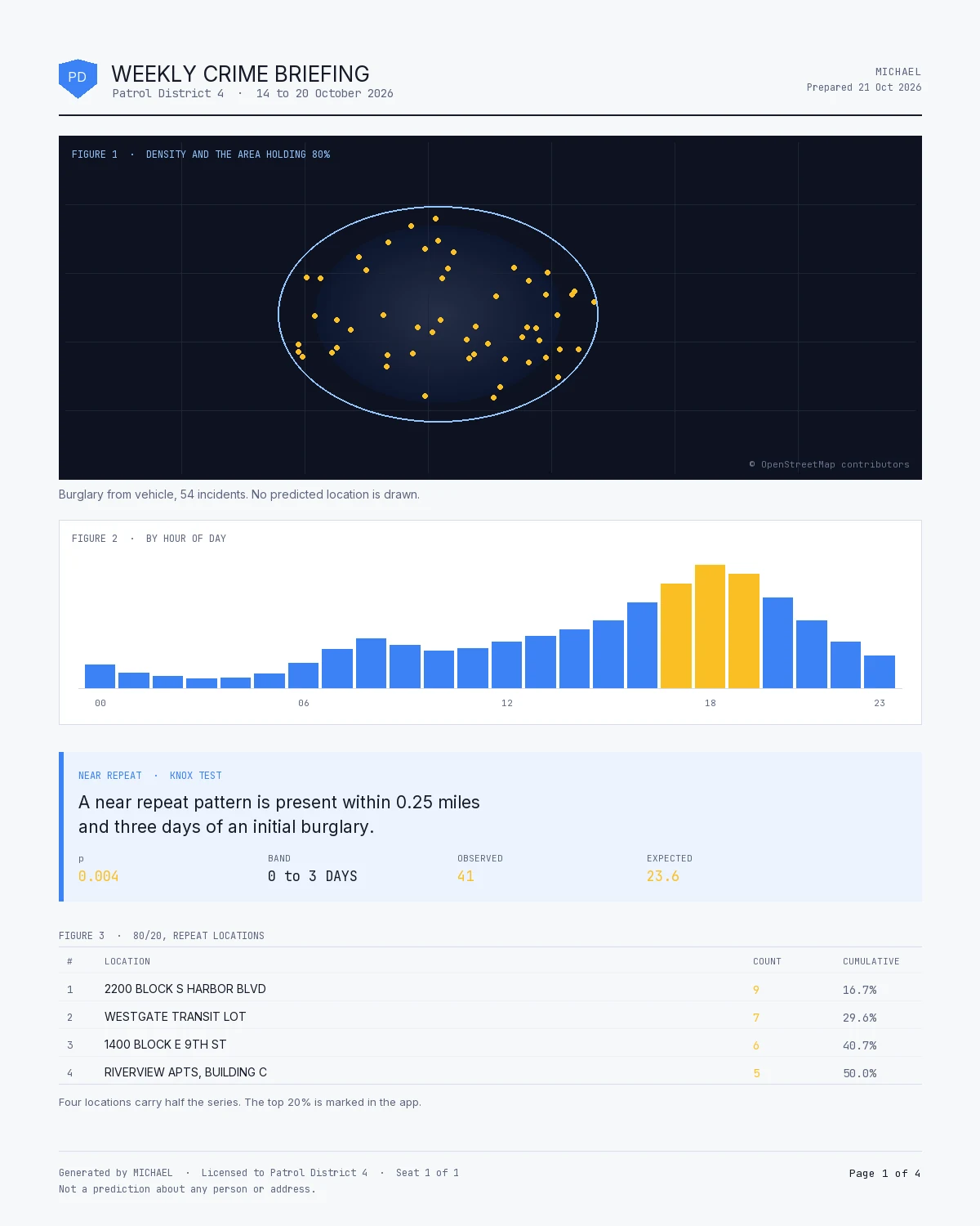
  7. Near-repeat (space × time)

Financial

  1. Pareto (80/20)
  2. Cost curve
  3. Experience curve
  4. High-low-close
  5. CUSUM control chart
  6. Break-even
  7. Waterfall
  8. Comparative period
Distribution
Regression
Pareto
CUSUM
Statistical rigorChi-square cells under 5 are flagged the way a statistics professor would want. Outliers run Z-score and IQR together, ranked by severity, and clicking a row jumps straight to the record.
07 Social network

The network hiding inside a table of incidents.

Check off suspect name, vehicle, phone number, address, gang affiliation. Records sharing a value get connected, and each field draws in its own color.

DegreeDirect connections
ReachUnique nodes within two hops
Reach efficiencySurfaces the efficient connectors, not the loud ones
BetweennessThe bridges whose removal splits the network
ClosenessWho reaches everyone fastest
EigenvectorWho is connected to the well-connected

Betweenness is the expensive one, and it runs about 19 times faster here than the textbook version, so a real case file does not lock up the screen. When a graph is big enough that the calculation gets skipped anyway, the app says so rather than reporting a silent zero.

Network / CommunitiesLABEL PROPAGATION

Community detection by label propagation. Focus mode isolates everything within one to five hops of a selected node.

08 Patrol workload

Officers per thousand residents was discredited decades ago.

That ratio cannot see call volume, service time, or anything your officers actually do with a shift. Most staffing studies still run on it. This one answers the question from your CAD export instead.

  • 01Dispatched and self-initiated work are shown apart, and never added together. Dispatched work arrives whether or not anyone is free. Patrol checks and traffic stops are what officers do with the time that is left over. Add the two and you overstate how busy the agency is while hiding the slack that proves you have room. On the first real extract we ran, patrol checks and traffic stops were 42% of all rows.
  • 02One row per responding officer. A call held by three units for forty minutes is two officer-hours, not forty minutes.
  • 03It adapts to your export, not the other way round. It reads the roles you assign to columns rather than their names, so another agency's export needs a re-designation and not a new version of the software. It uses the call source your CAD recorded; where your CAD recorded none, it guesses from the call type and you correct it in a click. Where the two disagree, the screen says so and names the types.
  • 04Service times as median and 90th percentile, never an average. The distribution is right-skewed and the long tail is what eats a shift.
  • 05Demand by hour and day of week, averaged over each weekday's own occurrences. A date range holding five Fridays and four Mondays would otherwise make Friday look 25% busier.
  • 06Rejected rows counted by reason and shown. Negative durations, zeroes, anything past a ceiling you set. A workload total that quietly drops rows is wrong in the direction nobody checks.
  • 07Capacity read from the same extract, no roster file needed. A unit that appears on a date worked that watch, so scheduled hours come from the export itself and the watch spans are read from your data rather than typed in. Saturation is committed time against net available, and out-of-service hours come off the denominator, where they belong.
  • 08The staffing answer, with its assumptions on screen. How many positions the demand supports, which hours cross the Rule of 60 line, and which beats run hot. Every judgment call behind it (relief factor, threshold, staffing level) sits on the panel as a number you can move, not in a footnote. On the sample it finds one beat at 87% against another at 17% with positions in hand force-wide, and names that a reallocation finding, not a hiring one.
  • 09Beat balancing that moves boundaries, not officers. Reporting districts are the atoms; reassign them between beats and every figure recomputes. It balances on citizen-generated committed hours, never a call count, and there is deliberately no optimizer: you know which streets are barriers and which neighborhoods must not be split. The tool does the arithmetic, which is the part people get wrong by hand.
Workload / Two kinds of workNEVER SUMMED
Share of officer-hoursSample CAD extract
Dispatched · citizen-generated74%
Self-initiated26%

Two bars, never one. Self-initiated was 42% of all rows on the first real extract, and folding it in would have counted the agency's spare capacity as capacity consumed.

Service timeMedian 21 min · P90 73 min

The skew is why the median is the honest number: a mean gets dragged right by the long calls and reports a shift nobody worked. A sample CAD extract ships with the app, so you can see all of this run before you export anything of your own.

09 Series Finder

Point it at a year of data. It names the series.

Unsupervised crime series detection. Nobody maps a schema, nobody sets a weight, and every link it draws can be read out loud in a briefing.

  • 01Rarity does the weighting. Every field is weighted by how rare the values being compared actually are in your data, so two burglaries sharing an unusual point of entry count for far more than two sharing a common one. The analyst configures nothing.
  • 02It works on the columns you already have. Categorical, numeric, date and coordinate fields are all weighted the same way. No schema to map, no required fields.
  • 03Every link is explainable. A series opens with the fields its members actually agree on and the share that agree, and continuous fields report the real quantity: 275 meters apart, never a similarity score.
  • 04It prints what an ordinary pair scores in your data. Every dataset has a tightest cluster, so a tool with no baseline will always find one and call it a series. The baseline sits beside the result, and a finding has to clear it.
  • 05It is allowed to have no opinion. Pairs with too little in common score nothing at all rather than zero, because "not enough overlap to judge" and "these are unalike" are different answers, and only one of them is honest.
  • 06Deterministic, and it goes to the globe. Two runs of the same query return the same series in the same order, which matters when the output is read into the record. Open a series as a space-time object and forecast where the next event falls.
Series Finder / One finding, openedILLUSTRATION
Fields the members agree onShare in agreement
Point of entry · rare in this data7 of 7
Narrative keyword6 of 7
Hour-of-day window6 of 7
This seriesclears the baseline
An ordinary pair in the same datathe baseline

The baseline is printed beside every finding. A series only counts if it clears what an ordinary pair scores in the same dataset.

A stylized rendering of one opened finding, not a screenshot, and the shares are illustrative. The rule they illustrate is real: rarity sets the weights, agreement is shown field by field, and the result stands next to its own baseline.

10 Enhance

Most agency data is not ready for analysis.

Addresses with no coordinates, a date column the software has to be told about, no field anywhere for hour of day. This is the view that fixes all of it before you start.

  • 01Batch geocoding. Addresses in, latitude and longitude out, with a confidence rating on every hit. OpenStreetMap Nominatim is free and needs no key at all, or use Google with your own. Records that already have coordinates are skipped.
  • 02It tells you the cost before it starts, and refuses the jobs it should. Small batches run free on OpenStreetMap Nominatim, quoted in minutes rather than in a usage policy nobody reads. Larger runs need a Google key, and the app says so up front instead of quietly hammering a service run by volunteers. Analysts do not read usage policies. They read time estimates.
  • 03Address columns found for you. One combined column, or street, city, state and ZIP sitting in four separate ones. Either way it works out which is which.
  • 04Nine computed fields, one click each. The ones you would otherwise build by hand every time you start a new case.
  • 05Field roles. Tell it which column is the start date, the end date and the value, and every other view uses them. Detected on load, overridable by hand.
Enhance / Computed fieldsONE CLICK EACH
Batch geocode · 50 addresses · Nominatim~1 min
Day of weekMON … SUN
Hour of day0-23
MonthJAN … DEC
YearYYYY
SequenceCHRONOLOGICAL
T-coordinateHOURS FROM 1ST
Inter-event timeDAYS BETWEEN
Inter-event distanceKM BETWEEN
DurationSTART → END

Sequence, T-coordinate and inter-event time are what the temporal and behavioral views run on. One click here, instead of a morning of spreadsheet formulas.

11 AI

An analyst's assistant with your data in front of it.

Not a chatbot bolted to the side. The model sees a profile of your dataset: every column, its type, its distinct count, its top values, its range, the date span. It answers about your records, not about crime in general.

  • 01It writes and runs the math. When a question needs a computation, the model returns JavaScript that executes in a sandbox against the loaded records, and you get the number.
  • 02It builds charts and filters. Ask to see something and the answer arrives with a filter you can apply to the grid in one click.
  • 03Your key, your account, your model. The key is stored in your browser and used to call the provider directly, with no server of mine in the path. "Refresh list" queries the API so the dropdown only offers models your key can actually call.
  • 04What actually gets sent. Your question, a profile of your columns, and the first five records of your dataset, complete and word for word. MICHAEL says exactly that on the screen where you type the question, before you send anything.
AI analystCTRL + J
You

Your question and the records it references go from your machine to the provider, on your own account. Nothing routes through a MICHAEL server. Neither Anthropic nor OpenAI train on API traffic by default, and retention is governed by your account terms, not by switches I control. Read them and set the account the way your policy requires.

12 Pricing

$2,450 a seat, per year. Everything included.

One price and one build. Nothing held back, no trial tier, no modules, and no paid upgrades. Every seat runs the identical workstation with everything switched on.

  • $2,450Per seat, per year. Police, sheriff, fire, dispatch, and corrections. Retail loss prevention, organized retail crime teams, insurance, private investigations, consultancies. Same build, same license, same everything.
  • INEverything, for everyone. Every update and every new version, email support answered in about two business days, the guided tour and ten chapters of training, sample datasets, and classroom course material.
  • INThe desktop workstation. The Windows installer, running on the analyst's own machine against the analyst's own data. The browser build is part of MICHAEL Regional, the multi-agency version, and is quoted separately.
  • ASKAcademia and nonprofits. Programs training the next generation of analysts, and nonprofit organizations doing the work without a budget for it. Email me and we will work something out.
  • OUTCustom development, data cleanup and migration, and live training sessions. Ask me if you need them.

Multiple seats, agency pricing, or academia and nonprofits? Email im@seanbair.ai and we will work it out.

Waitlist

Want a copy?

Get the release date and first access. No newsletter, no drip sequence. I will write when there is something to say.

Built for the people who do the work Sworn agencies, crime analysis units, public safety partners, and corporate investigation teams. Seats are $2,450 a year, everything included. Academia and nonprofits, get in touch.